


The Ultimate All-in-One
Print Shop Software
Take control of your business growth with STAHLS’ Fulfill Engine, the ultimate e-commerce and production management solution. Specifically made for apparel decorators by apparel decorators, Fulfill Engine is a comprehensive ecosystem that empowers you to seamlessly manage your business from order capture to fulfillment, ensuring efficient and cost-effective production along the way.
How Will Fulfill Engine Help My Business?
Fulfill Engine offers a range of powerful tools, including Quote to Order capabilities, white-label stores, near real-time inventory management, credit card processing integration, and more. It’s the complete package to take charge of business growth, enabling online sales, efficient sourcing, trusted contracting, and streamlined manufacturing management.

Sell More with Simplified Online Selling
- Shopify integration
- Easily create unlimited white-label web stores
- Automated product mockups
- Customizable rules for each web store

Eliminate Data Entry & Sourcing
- Simplified order staging through integrated bin system
- Real-time supplier inventory with automated purchases at designated thresholds
- Physical inventory management with low stock alerts

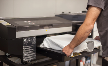
Automated Production with Scan to Print
- Intelligent priority management system
- Scan to print QR code label system to instantly access job details
- Cloud-based, paperless work orders
- Automated efficiency reporting
- Supports production workflows of heat printing, dye sublimation, DTG, embroidery, and in-house DTF transfer printing

Integrated Shipping & Fulfillment
- Integration with shipping partners
- Automated shipping label creation
- Minimize costs with automated shipping groups
- Custom pack-ins & 3PL support

Easily Scale with Connected Decorator Network
- Offer more decoration methods without investing in new equipment
- Accept more orders without increasing production
- Accommodate higher demand with overflow support for direct to film, embroidery, screen printing, and DTG
- Say yes to any type of decoration


Partner Testimonials
"From receiving to shipping, the data flow is 100% automated and keeps our production team focused on production, not on data entry.”
- Rodney McDonald, US Colorworks“As an on demand + 3PL order management solution, Fulfill Engine is the industry leader providing our company the tools needed to meet our clients needs and continue to scale.”
- Blake Burroughs, Topshelf Printing
Empower Your Business with Fulfill Engine
Limited-Time Offer
$1499
$799 One-Time Onboarding Fee
3.5% Transaction Fee
$0.50 Shopify Per Unit Fee
Sales Portal & Ordering
• Quote To Order
• Integrated Supplier Inventory
• White Label Online Stores
• Shopify Integration
• Order Importing
• Integrated Supplier Inventory
• White Label Online Stores
• Shopify Integration
• Order Importing
Sales Portal & Ordering
Shop Management
• Automated Apparel Sourcing
• Automated DTF Transfer Ordering
• Damage & Replacement Tracking
• Integrated In-House Inventory
• Bulk + On Demand Fulfillment
• Automated Order Email Notifications
• 3rd Party Logistics & Pack-Ins
• QuickBooks Integration
• Automated DTF Transfer Ordering
• Damage & Replacement Tracking
• Integrated In-House Inventory
• Bulk + On Demand Fulfillment
• Automated Order Email Notifications
• 3rd Party Logistics & Pack-Ins
• QuickBooks Integration
Shop Management
Supported Decoration Methods
• Heat Printing Operations
• Dye Sublimation Operations
• Direct to Garment
• In-House DTF Transfer Printing
• Embroidery
• Dye Sublimation Operations
• Direct to Garment
• In-House DTF Transfer Printing
• Embroidery
Supported Decoration Methods
Contract Printing Network Access
• Direct to Film
• Embroidery
• Screen Printing
• Direct to Garment
• Embroidery
• Screen Printing
• Direct to Garment
Contract Printing Network Access
Shipping & Fulfillment
• Integrated UPS/USPS
• Use Your Own Carrier
• PSST / Vendor Rules
• Use Your Own Carrier
• PSST / Vendor Rules
Shipping & Fulfillment
Enterprise Solutions Available for Commercial Decorators
Featuring full-shop management for all decoration methods, including screen printing operations, enhanced metrics, custom integrations, and more!